25. Liam, Diana, Andrea and Valerie from 283goswellg on Vimeo.
Showing posts with label Valeria Leon. Show all posts
Showing posts with label Valeria Leon. Show all posts
Monday, 23 May 2016

Thursday, 21 January 2016
Goodbye :)
As this is my last blog post, I decided to leave with a short video I made with bloopers of videos I tried to record for other posts.
Enjoy :)


53. Shortlist of pictures
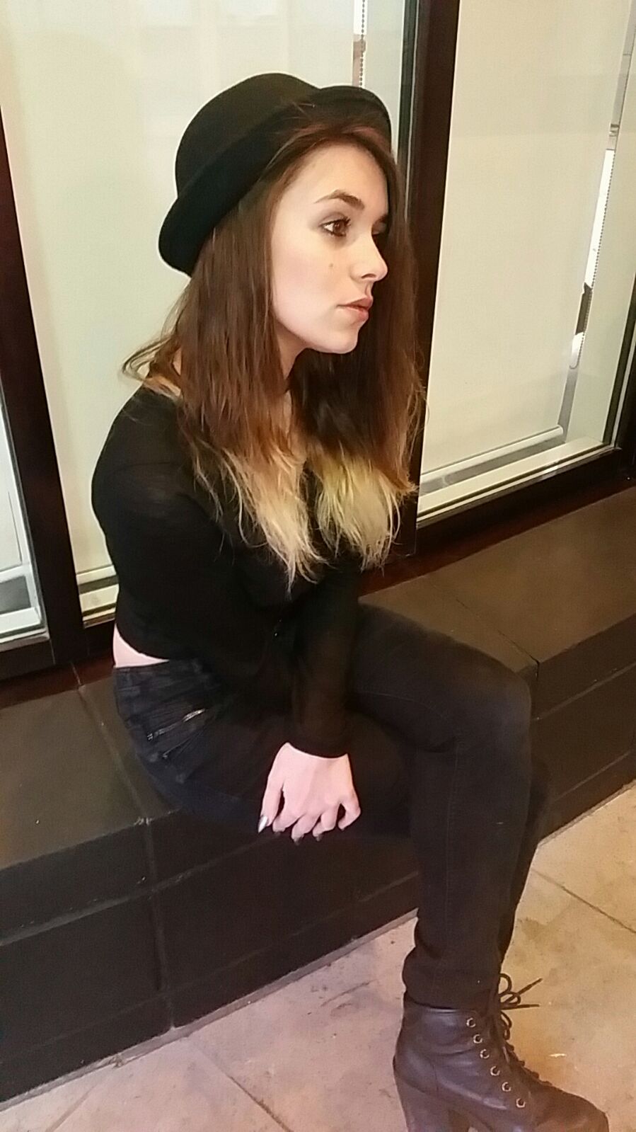
As the pictures I had originally set out to use for my ancillary products were not used in my products, I have made a new selection of images that were taken and used in my Digipak and Website.




51. Influences
Some of the existing artists that influenced my on my Digipak and Website were:
- Taylor Swift
- The Paper Kites
and other artists. I only analysed two artists products in order to help me with mine, as well as the original artist, Gabrielle Aplin.
Taylor Swift

The Paper Kites

The Main artists that I was inspired for my website was The Paper Kites. This is because of the fact that their website is simple but very effective.
Gabrielle Aplin (The original artist)

Wednesday, 20 January 2016
Evalution Question 3
How did you use media technologies in the construction and research, planning and evaluation stages?
When it came to filming our music video, we had to research carefully into what exactly it is that we needed to use in order to make our video somewhat similar to the original one.
The pre-production stage:
From the media department we borrowed equipment such as the camera, fig rig, dedo light and also a top light.

With the camera we took out from the media department, we already had practice with it, we knew exactly what buttons we would need and how to film what we needed. The camera was the main technology, as this is the one that helped us capture the shots and angles we needed.
We all took turns at filming with the camera, however, we realised later on, after looking back at the footage that some of us were not so good at filming as it came out shaky, out of focus or the framing was bad. In order to avoid this, we let only one person with a steady hand film, which was Diana.

The original plan for us to have more of a free flow and steady shot, was that we were going to use a fig rig. At the beginning of our filming, in Hampstead Heath, we did use a fig rig in order to get a more steady move when we were following the artist. However, when it came to filming the indoor scenes at the house, we found out it was quite hard to move from room to room with the fig rig as it was quite big and wide. In the end we decided to not use the fig rig for the indoor scenes, as in some of our footage we had to cut short because as we were coming out of a door, we banged the fig rig on the wall and it caused bad filming.
 We had asked to take out a dedo light because of our intentions of filming a scene in a bathroom and we wanted to make it have an atmosphere of loneliness. However, we actually forgot to use the dedo light when we went to film this scenes, and as a result of this, the scene did come out a big dark but when we started editing, we managed to change it to make it a bit brighter.

Social media pages such as Facebook, Twitter and Instagram were made in order for our target audience to find out things, such as sneak-previews/behind the scenes, also, it was for the teachers to keep updated with our filming progress, following up the production schedule. We posted pictures on our Instagram every time we were at a different location for filming, videos of when we were filming and on our twitter, we posted tweets about our locations or any days we had to re-schedule our plans. Our Facebook page was mainly to post our pictures of filming and to post our final music video, this was more of our professional page for our audience to get involved.
 Blogger was the main website which was used everyday in order for me to post my work, from the planning moment, to the filming and editing and more. It has allowed me to present my work in various different ways, as I would use different apps and would be able to post it on Blogger.
Everything I did, I always made sure to post it on Blogger, this allowed my teachers and group to know what I was up to, also, if someone in my group needed ideas on how to do a certain blog post, they always had the opportunity to look at mine or others in order to help them.
 I used google almost everyday, this was to search things like website and digipaks from other artists, so when it came to doing mine, I had a rough idea of what to do. I also used it to search how to do things such as, how to do something on Photoshop.
 I used Weebly to make my website for my artist River. I had already had experience with using Weebly, this meant that I could straight away get on with the work I needed to do. It was the main app for me to produce and finish my website. I downloaded it onto my phone so I could always change or add things onto my site, on the go.

I used YouTube in order to research songs and ideas, before I had -planned out my music video. It allowed me to have a number of songs that were my inspiration for our final product. It also helped me to analyse each song especially the original one.
The post production stage:
Finally, when it came down to the stages of editing not only the music video, but to my ancillary products such as my digipak and website, I made sure to have some screenshots that allows my teachers to follow my progress through to my final product.
 For editing my digipak, I used Adobe Photoshop, I have had practice with Photoshop before as I study Photography. I tried to keep my outside layer of my digipak quite simple and kept it to a minimum of 3 colours, in this case it was black, white and gray. I made sure to include the necessary information such as, the track lists, the image of my artist River, the artist name and
 album name, the bar code, copyright and record company label. In the two images above, you can see the difference of effectiveness it had as soon as I added the white box and the track list on top of it, it was more visual rather than putting it on the background.
 When I was editing, I wasn't sure if to use the same picture as my background because I was worried it would make the album as a whole, a very basic and plain one. However, I changed the way the picture of the artist was presented, I copied and pasted the same image three times, and made sure they overlapped, I then changed the opacity of the two last images so that it looked like she was fading into the background.
 As the image of our artist was originally with bright colours, I changed the hue and saturation to make sure that the rule of keeping my digipak to a minimum on 3 colours was kept like that.
I didn't just want to write the name and album name of our artist so I played around with the album name 'Home is where the heart is' to make it circle around the CD.
 I kept the background picture as the CD picture because I like that in the music video, the scenario shots were of trees with bright green and yellow leafs and mine are just of branches in the sun. It gave the sort of opposite feeling.
When it came to editing the music video, the only particular effects we use were slow motion and black and white in the flashback scenes to make it appear as a flashback.
We all took turns at filming with the camera, however, we realised later on, after looking back at the footage that some of us were not so good at filming as it came out shaky, out of focus or the framing was bad. In order to avoid this, we let only one person with a steady hand film, which was Diana.

The original plan for us to have more of a free flow and steady shot, was that we were going to use a fig rig. At the beginning of our filming, in Hampstead Heath, we did use a fig rig in order to get a more steady move when we were following the artist. However, when it came to filming the indoor scenes at the house, we found out it was quite hard to move from room to room with the fig rig as it was quite big and wide. In the end we decided to not use the fig rig for the indoor scenes, as in some of our footage we had to cut short because as we were coming out of a door, we banged the fig rig on the wall and it caused bad filming.


Social media pages such as Facebook, Twitter and Instagram were made in order for our target audience to find out things, such as sneak-previews/behind the scenes, also, it was for the teachers to keep updated with our filming progress, following up the production schedule. We posted pictures on our Instagram every time we were at a different location for filming, videos of when we were filming and on our twitter, we posted tweets about our locations or any days we had to re-schedule our plans. Our Facebook page was mainly to post our pictures of filming and to post our final music video, this was more of our professional page for our audience to get involved.

Everything I did, I always made sure to post it on Blogger, this allowed my teachers and group to know what I was up to, also, if someone in my group needed ideas on how to do a certain blog post, they always had the opportunity to look at mine or others in order to help them.


I used YouTube in order to research songs and ideas, before I had -planned out my music video. It allowed me to have a number of songs that were my inspiration for our final product. It also helped me to analyse each song especially the original one.
The post production stage:
Finally, when it came down to the stages of editing not only the music video, but to my ancillary products such as my digipak and website, I made sure to have some screenshots that allows my teachers to follow my progress through to my final product.


I didn't just want to write the name and album name of our artist so I played around with the album name 'Home is where the heart is' to make it circle around the CD.


Made with Storyboard That
This is the storyboard made by Diana, it explains what we had originally planned out to have in our music video. Our animatic is one that we stuck by, it includes almost- if not all the scenes that were needed in our music video.
Tuesday, 19 January 2016
Evaluation Question 4
What have you learned from your audience feedback?
The audience feedback for me, was important and very effective, it helped me to realise immediately what needed to be changed to make our music video better.
As I did not personally attend the screening of the music videos at the Islington Cinema, I had one of my group members record the reaction of the audience when our names were appearing on the screen. Even though the video is very short, you can sense the atmosphere of the room from the audience when our video was about to screen.
Unfortunately, the video, when uploaded onto YouTube was turned upside down, however, the point of the video is to hear the reaction of the audience after our video was finished.
From my audience feedback, I have realised that my strongest product was my Digipak, however when it came to my website for my artist, it was good but did not relate as much to the video as the digipak did.
Diana Baukerte also, mentioned the fact that I had kept my digipak to a minimum of 3 colours and had included the picture of the branches of the trees as my background image and kept it running throughout the album cover, inside and out. This related to the music video we had created.
Unfortunately, I did not manage to get any videos of my target audience talking about my website but here are most of the things that came up:
During the editing process of our music video, we asked our fellow class members to look over our music video and get their honest opinions. Most, if not all, the members liked the video but were all sort of confused on the chorus, it was intended to look like a flashback for 2/3 of the chorus but due to the fact that there was no sort of special effect in this area, they did not understand our intentions with these scenes.
After receiving the feedback from people who were geniuanlly our target audience, we decided to change the flashbacks in Premier Pro, to make them appear more like what they were meant to.
This meant that we changed the colouring of the scenes into black and white and even in some parts, made them slow motion to show the emotions of the couple.
The audience feedback for me, was important and very effective, it helped me to realise immediately what needed to be changed to make our music video better.
As I did not personally attend the screening of the music videos at the Islington Cinema, I had one of my group members record the reaction of the audience when our names were appearing on the screen. Even though the video is very short, you can sense the atmosphere of the room from the audience when our video was about to screen.
Unfortunately, the video, when uploaded onto YouTube was turned upside down, however, the point of the video is to hear the reaction of the audience after our video was finished.
From my audience feedback, I have realised that my strongest product was my Digipak, however when it came to my website for my artist, it was good but did not relate as much to the video as the digipak did.
After having been reviewed by Liam Hughes, I felt as if i had followed the folk genre conventions that were expected. In the way that I had kept my digipak colours to a minimum of 2-3 colours and made sure that they were earth-tone colours.
The reaction I received was one that I was very proud of, this helped me to realise what were my strongest and weakest points.
Diana Baukerte also, mentioned the fact that I had kept my digipak to a minimum of 3 colours and had included the picture of the branches of the trees as my background image and kept it running throughout the album cover, inside and out. This related to the music video we had created.
Unfortunately, I did not manage to get any videos of my target audience talking about my website but here are most of the things that came up:
- The website did not have any text on the artist
- There were a lot of various different pictures of the artist which was good
- The theme of the website did not relate to the digipak or the music video but it gave its own atmosphere
Friday, 15 January 2016
Evaluation Question 2
Method: Video
How effective is the combination of your main product (video) and ancillary texts (digipak/band website/ advertisement)?
What was spoken about:
- Talk first about the kind of products that were going to be used for synergy (the guitar and bowler hat), how did we plan to use synergy- in the music video have Heather wearing the bowler hat and also have the guitar either next to her, or her playing it.
- The video link in with the Digipak ( have picture of digipak) as i used the quite earthy coloured tone in my digipak and also, the background pictures are of tree branches, this links back to the video where we had very green/nature scenes in Hampstead Heath.
- With comparing the video to the website, I felt as if I didn't quite link them very well, talk about the website layout /dark and quite plain and simple/
- The audience are able to recognise the two products linked due to the fact that there is various different pictures of our artists - RIVER- on the website that were also used in the digipak.
- I think my target audience would be attracted to the digipak because I feel like it gives a very romantic feeling - which is good because it relates to the song. it also has a nice bright but dim layout whereas the website is all just quite dark and plain, didn't have text at all so it is just quite visual and sometimes can be seen as boring.
- COMPARING - Place images of the digipak and website in comparison to Taylor Swift and The Bloom.
Evaluation Question 1
Method: Video Clip of myself.
Include screenshots and also video links to original songs.
In what ways does your media products use, develop or challenge forms and conventions of real media products?
.
Points that were spoken about:
- Talk about your research into Vernallis and Goodwins theory, explain what they are, state if my video supports or not, their theories, in this case, our video supports Vernallis's theory all together, the narrative, editing, camera movement and framing and also the diegesis. Talk more in depth about specific scenes, such as the ones in Hampstead Heath.
- Talk about how our video does not support the Laura Mulvey theory, where women are seen as a sexual object within the video, talk about how our actor does not have revealing clothing, and there is not just one guy being preyed on by various different women in a location where it would be acceptable for our artist to have very sexual and revealing clothes.
- Talk about the music video that inspired ours, the music video Back to December by Taylor Swift, The Paper Kites by Bloom, have screenshots next to the screen shots from our own music video, explain that they were similar to our original artists video due to the genre and 'earthy' scenes, also talk about the original music video and how we tried to make it as similar as possible but talk about what bits were changed.
- What aspects specifically did we want in the music video, talk about how in the original music video, we wanted it to have the same, open space atmosphere where she appears lost in the middle of nowhere, so the visual style. The camera and editing work from The Paper Kites, throughout the whole video, specifically the beginning with the guitar and the actress and the close up of her - relate that back to our music video where we have the shot of Heather closing her eyes.
- We didn't challenge the conventions of the genre of the video, we kept it to the folk type music it is.
- My digipak relates to the conventions of the music video, this is because following the narrative point of the song, it's quite a delicate, love song and i feel like my digipak has 1. that genre type going along with it, the image of the trees and the way they have been manipulated, also the image of my artist, her looking down makes it seem like shes fragile, quite cute. 2. the overall layout and design of my digipak gives the audience a sense of emotion.
Tuesday, 12 January 2016


Friday, 8 January 2016


Tuesday, 5 January 2016
Blogging Health Check 3

After reading the comments on my blogging health check, I have only two weakness which are the continuos posting of blogs, the order of my posts and also the little evidence that I put into my ancillary posts (research and planning)
I already started to put more detail into my posts, also blog more often and also number my posts so even when they are not in order it is easier to find blog after blog and follow.
Monday, 4 January 2016
54. Costume - Repost
We will have three costume changes.
(similar clothes)
First costume change:
(similar clothes)
First costume change:

An oversize jumper, blue jeans and black boots.


And some black plain shoes
Third costume change:

A pyjama for the indoor location in Diana's house.
52. Do's and Dont's
Do's for web design:
Plan
The first and most important thing to have ready before doing anything is having a plan, even though I might not exactly follow everything I have planned out, it will give me an idea and set me on a path. It will be useful so when I get stuck on something or need ideas, I can refer back to my plan.
Audience:
Not only do I need to reach out to the specific audience but my website also has to appeal to the same audience as it will give me an opportunity to boost up my music video.
The audience ranges from 18-24 year old females.
A way to reach out to your audience is by having certain features that relate to them, for example, some social medias that people use nowadays i.e Twitter and Instagram instead of just having a website and a page on Facebook.
Website Platform
Usually when it comes to creating a website people usually tend to go for websites such as Blogger, however, I will be using the website Weebly, as I have experience with using this website and I find it fairly easy to use. I also like the idea that you can get laptop and phone versions of the website.
Vision
The website overall has to be visually attractive not only to me but to my audience, this will help me intrigue them more into looking more into the website and also find out more about the artist and music.
The overall layout of the website will be very soft, I don't want it to appear too crowded with pictures everywhere.
Dont's:
CopyrightGathering ideas from various different artists websites is fine, just as long as the website I am creating is not exactly the same and also that any sort of unique part of their website is included in mine, this is because it will be copyright from the original artist.
Stealing- Stealing images and songs comes under copyright, in order to have images on my website I will either need to ask for permission from the original artists or make my own using Photoshop of my artist and try to make it as similar to the original as possible.
Do's for Digipak
Layout:
The same for the website, my Digipak will have to have a very soft almost cute/plain layout, this is to follow the concept of the artist and the music. It will have minimum two soft colors, the name of the artist and the name of the song, back and front (optional where they go)
Images:
When choosing the images that will go on my digipak I have to make sure that they are of high quality, they allow the audience to see the image with no problem or sign of blurriness.
Synergy product(s):
Having the synergy products I used for the poster and within the music video, on the digipak will help me promote not only the artist but also shows what kind of music it is, this is because the acoustic guitar and bowler hat represents the folk-type music it is.
Dont's
Fonts/Colors/Background images:
Making sure that the font is one that will relate to the artist and music, I decided to go for one that is quite soft, cute and sweet as the music is very lovey.
The colors of the font, I have to make sure that they are visible and do not just blend into the background.
The background images, I will try to just keep it at soft colors instead of having visual images as this will also look too messy and over crowded.
Sunday, 3 January 2016
50. Individual Ideas for Digipak/Website
Even though as a group we have decided on some ideas, however as we are all making our own individual digipak and website.
The groups ideas are on a different blog post, on this post I will share my own ideas that I want to include:
Digipak -
Fonts/Color : The font for the original cover of the song is quite soft/fragileand I want to have the same sort of font so I have selected 5 out of 14 optional fonts that I think will suit the genre of music and also the song.

The five I have narrowed it down to are: 2,5,9,11,14. This is because I feel like they relate more to the music and the original cover.
These are the kind of fonts I have decided on, the reason is because they are soft and pastel colored which relates once again, back to the original album cover for the original song. Although I have no narrowed down the colors I wish to use, the idea of using soft colors is one that I will stick to.

Saturday, 26 December 2015
48/49 Ancillary text 1&2
The artists that are similar to our original artist - Gabrielle Aplin are:

Birdy
http://officialbirdy.com/
Christina Perri
Christmas work
During the Christmas holidays I will be focusing on my ancillary production. I will be researching into ancillary products and digipaks will hopefully completed by the time I go back to college in January.
The research I will carry out will give me an idea of what is needed to make a digipak successful. effective and appealing so when I make mine, I take these things into consideration.
With the research I have carried out on a separate blog post, I will create a plan and a complete website for my artist. I plan to carry out more of a detailed research so that I get enough plans from various different artists and their websites.
After the website I will plan out my digipak and get straight to work when I go back to college, I can't download the 30 day trail of Photoshop and I don't know anyone who might have Photoshop, to avoid going off course I will have my plan completed so when I get back I can get on with my digipak straight away.
When it comes to planning my digipak I want to make sure I have everything I need, this includes having pictures of the artist with the synergy products and having my research on different types of fonts or any sort of conventions that are needed for a successful digipak.
The research I will carry out will give me an idea of what is needed to make a digipak successful. effective and appealing so when I make mine, I take these things into consideration.
With the research I have carried out on a separate blog post, I will create a plan and a complete website for my artist. I plan to carry out more of a detailed research so that I get enough plans from various different artists and their websites.
After the website I will plan out my digipak and get straight to work when I go back to college, I can't download the 30 day trail of Photoshop and I don't know anyone who might have Photoshop, to avoid going off course I will have my plan completed so when I get back I can get on with my digipak straight away.
When it comes to planning my digipak I want to make sure I have everything I need, this includes having pictures of the artist with the synergy products and having my research on different types of fonts or any sort of conventions that are needed for a successful digipak.
Friday, 11 December 2015
Group design ideas(Digipak/Website)
Digipak
- We want to make sure that the bowler hat is included on the digipak and maybe even the gitar to create a sense of synergy.
- The colour scheme that we want to go for is rather desaturated/black and white and maybe some earthy colours similar to that of the artist Birdy.
- We want natural colours/Scenery with the artist wearing minimal make up
- The artists name River will be in bold black writing
- Our album title will be 'Home is where the heart is at' preferably sorta hand written to make it seem rather folky and down to earth
Website Homepage
- Bowler Hat/Guitar
- Social media
- New, updates, music, shop and basically tabs
- Earthy/muted colours
- We're gonna use the same font to create a good sense of synergy
Thursday, 10 December 2015
40. 3rd Filming Day (Day of Re-shooting)
During the filming process we had to refilm a lot of the work we had originally filmed due to feedback we had gotten from teachers, these included:
-Base tracks, we originally only had 3 basetracks so on our day of reshooting we tried to film as many base tracks as we possibly could to fill up the verses and to get some more interior ones.
-We also needed to refilm our second lot of flashback scenes again due to bad camera angles however we were unable to film at the original house so had to choose a new location. Another problem was the space in between the actors and the space above them, there was a large white gap.
-Base tracks, we originally only had 3 basetracks so on our day of reshooting we tried to film as many base tracks as we possibly could to fill up the verses and to get some more interior ones.
-We also needed to refilm our second lot of flashback scenes again due to bad camera angles however we were unable to film at the original house so had to choose a new location. Another problem was the space in between the actors and the space above them, there was a large white gap.
Subscribe to:
Posts (Atom)