25. Liam, Diana, Andrea and Valerie from 283goswellg on Vimeo.
Showing posts with label Diana Baukerte. Show all posts
Showing posts with label Diana Baukerte. Show all posts
Monday, 23 May 2016

Thursday, 21 January 2016
Formally Closing Off Blog
I have made it to the end of my media coursework and blogging. I have learnt a lot, enjoyed myself and met some amazing people. I thought I'd share this blooper video again from our filming stages of this project
Evaluation Question 4
What have you learned from your audience feedback?
This was the rough cut of our music video
We received some constructive criticism and feedback and were able to improve it. We knew it wasn't perfect and it needed work as it wasn't where we wanted it to be and we knew it was out of sync but we thought we were making good and steady progress.
We received feedback from our teacher as she watched our rough cut and we noted what she said decided on how we were going to make adjustments to the cut in light of the feedback.

These were our comments on the feedback we received. I will be analysing how much we followed through with the feedback and our own comments. The emaze below discusses the feedback and how much we followed it:

I also got further feedback from my core target audience:
comments from Diana Baukerte on Vimeo.


This feedback was very important to me because it came from friends my age (our target audience) so I trusted their opinions. It was also important to hear what they liked about the draft so that we know what we should keep at and leave in the video. The bad points were more important I think because we had time to improve on these things. The major issue was the syncing of the video with the audio and because it was mentioned the most from my feedback, we made sure that we spent a good amount of our remaining time sorting out this issue, we then focused on the other issues such as transitions between shots.
I feel like we acted on all the feedback given and improved our video because of it. We received positive feedback at the final screening.
This was the reaction to our music video at the final screening:
IMG_4233 from Diana Baukerte on Vimeo.
The reaction was positive, our video received a round of applause which was satisfying when reflecting on how much work and effort was put into the video; it made the work worthwhile.
The reaction was positive, our video received a round of applause which was satisfying when reflecting on how much work and effort was put into the video; it made the work worthwhile.
This is what our target audience had to say about our music video:
feedback for final video from Diana Baukerte on Vimeo.
All of the comments given after the final screening were positive, the majority of comments were given by our core target audience which shows that we have improved on the feedback from the rough cut and the general positive final feedback can be generalised to a wider audience. However, it would help to get even more feedback.
If we were able to create the music video again, there would be things that could be improved. One of the comments was a little negative regarding the costume of our artist at a certain part of the video; it came across as a little to revealing for the genre of our song. Therefore, we could have reconsidered some of the costume or perhaps the way it was worn/presented in the video.
All of the comments given after the final screening were positive, the majority of comments were given by our core target audience which shows that we have improved on the feedback from the rough cut and the general positive final feedback can be generalised to a wider audience. However, it would help to get even more feedback.
If we were able to create the music video again, there would be things that could be improved. One of the comments was a little negative regarding the costume of our artist at a certain part of the video; it came across as a little to revealing for the genre of our song. Therefore, we could have reconsidered some of the costume or perhaps the way it was worn/presented in the video.


This was the feedback on website when it was still in progress. I feel like I worked on the feedback well to some extent. I used only two fonts as was suggested and I used the same two fonts for the digipak also. However, the image of our artist that looked like a selfie remained because I really liked the picture and you could clearly see her facial features. Therefore, some advice wasn't taken on board. Maybe, if I were to be able to make my ancillary texts again, I would use a different picture of the artist to make my products look more professional.


In light of this feedback, overall I am happy with my ancillary texts as many comments are positive. For example, feedback from both people mentioned my use of paper on the CD itself and how they like it and how it may suggests things about the artist and her music. I am happy with this because I put a lot of thought into the planning of my digipak and how I wanted to design it. Also, both pieces of feedback complimented me for my use of earthy colours and choice of font as it suits the folk genre and this suggests I have followed the codes and conventions of the folk genre which is what I intended to do from the very beginning.
Wednesday, 20 January 2016
Evaluation Question 3
How did you use media technologies in the construction and research, planning and evaluation stages?
These are the technologies I used for the research and planning stages of our music video:
These are the technologies I used for the production of our music video:
The most important piece of technology for this stage was the camera. Our shot types and camera work were already planned so we had to follow this plan. The camera was used for about three days and we all took turns using it. Most of the time, the camera was not used with a tripod because we wanted to get some natural movement in the video, it was used with a fig rig instead to keep it steady but allow movement. We made sure the camera was in focus before filming and that no unnecessary filters were on. Before beginning a certain shot or scene, we waited five seconds so that the editing process is made easier. We also didn't zoom in manually with the camera, instead we moved closer to what we were filming to get closer shots, this helped to keep the quality to a maximum.

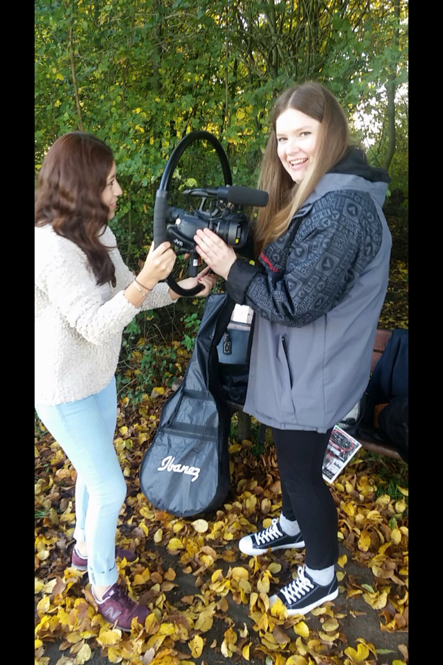
We also used a top light for the bath scenes, however this didn't prove effective because the light wasn't strong enough, therefore brightness (a spotlight) was added to this scene during editing.
We used social media to update our progress, get evidence of filming and so that our teachers can see our progress. Our social media:
Facebook
https://www.facebook.com/River-377960342414171/?fref=ts
Twitter
https://twitter.com/a2mediagroup25
The pictures that were taken during filming were displayed using Photosnack and Kizoa, these websites allow to make slideshows of photos with added music and transitions, you can then embed these slideshows on your blog.
I also made a video of some of the footage I took from the first filming day and I used Windows Movie Maker to edit the footage together and add music to make a video:
I also made a video of some of the footage I took from the first filming day and I used Windows Movie Maker to edit the footage together and add music to make a video:
Here are some pictures from our first filming day:
Use of Editing Software (Adobe Premiere Pro):
We used this throughout the editing process and created a number of rough drafts and the final music video. There were a number of features on this software which helped us to create our music video the way that we had planned.


How I Used PhotoShop from Diana Baukerte on Vimeo.
I also made an animatic storyboard using a website called StoryBoardThat:
I also made an animatic storyboard using a website called StoryBoardThat:


This technology allowed me to create a unique narrative with the use of existing, default images that are available on the website. It helped to bring the visual images we had in mind to life and help others see our idea clearly. I was then able to embed the storyboard onto the blog so that we could refer back to it ourselves when filming. We could also create new drafts of the storyboard if we had a change of mind about what we wanted to film or how something should be filmed, for example, if we wanted to change the shot type of a certain scene.
Tuesday, 19 January 2016
Evaluation Question 2
Question:
How effective is the combination of your main product (video) and ancillary texts (digipak/website)?


The audience can recognise all three products because of their shared features (synergy). All three products have Heather in the same costume and styling, therefore she is easily recognisable. Also, all products have a reminiscent feel, the polaroids represent the memories portrayed in the video. The visuals are very nature orientated, for example trees and greenery are evident across all products which add to the folky vibe.
My personal thoughts on the success of my ancillary products:
(I will look further at the success of my ancillary products by asking the opinions of my target, core audience as well as my wider audience).


I used commentary to talk about my own personal view on the success of our music video and its links to my other ancillary texts. I will also be judging the success of the music video based on feedback given by our target core audience as well as our wider audience.
summary of what I said in the commentary of our final music video:
- the opening shots are successful because they establish the natural surroundings which links to the folk genre really well
- we introduce the ancillary props early on in the video (the bowler hat and the guitar), I think we were successful in our choice to use two props because we had more choice when it came to creating our ancillary texts.
- A lot of the shots in the video are inspired by existing videos from the same genre as ours which shows we were successful at our planning and research
- The costume our artist wears is similar in style and colour throughout and is maintained for our ancillary texts which is successful at showing synergy
- the flashback scenes are clearly separated from other scenes with a black and white filter which successfully establishes the two different timings. I have successfully captured these flashback scenes with the use Polaroid pictures on my ancillary texts; these pictures are a reflection of the happier times in the video.
- The ending scenes are of the couple being reunited and I think we did this successfully by keeping the original colour of the video, the scene not being black and white suggests it is no longer a flash back
Do you think your target audience will be attracted to your ancillary products?
I think my our core audience would be attracted to our music video and my ancillary texts. This is because our ideas for the music video came from existing music videos by similar folky artists for example The Paper Kites and early Taylor Swift. Many of our shots were inspired by shots from these music videos. The audience of these artists is the same as our target audience, our work is similar to the videos that the target audience is attracted to, therefore, they are likely to enjoy our music video too.
A lot of my inspiration for my ancillary texts came from existing ancillary texts from artists similar to ours. The audience of these similar artists is the same as our core audience and they will therefore be attracted to my ancillary texts.
Our core target audience are females aged 18-24, the same can be said for both Taylor Swift and Birdy who I was inspired by:


My Ancillary Work Compared To Existing Products

Evaluation Question 1
What I Say In The Video:
Andrew Goodwin published a book
called “Dancing in the Distraction Factory” in 1993 in which he discussed why
he believed that music videos should not follow a narrative style. He didn’t
necessarily agree with the ideas that Todorov had. Todorov’s ideas followed a
story like sequence; almost like a beginning, middle and end. It starts with an
equilibrium where there is a balance between good and evil in the universe.
There is then a disruption where a negative event takes place. There is then
recognition of this disruption and the protagonist is usually the one that
notices it. There is an attempt to repair the disruption caused by the
antagonist. Finally, equilibrium is reached and balance is restored.
However, it doesn’t mean that music videos are very “avant garde” it
just means that they are easier to steer away from the narrative style. The
choruses are parts of the song that are repeated and this means that various
scenes can be repeated in music videos.
Illustration
is where the video narrates the lyrics to the song, amplification is where the
video introduces new meanings to a video but doesn’t contradict the lyrics and
disjuncture is where there is little connection between the video and the
lyrics.
Carol
Vernallis’ theory was more focused on the editing of a music video. She
summarised her theory with four main concepts. She believed in amplification
where the lyrics are brought to life on screen but the video may be fragmented
and pose questions that may not be answered. She believed that editing should
match the beat of the song but may break some rules e.g the 180 degree rule.
When it comes to camera movement and framing, she raises the idea that every
music video that accompanies a specific genre of music has its own shot types
for example many pop videos use wide shots to capture the dancers. She also
mentioned diegesis “the world within the music video” which may involve
repeating the same shots at different angles so that the audience has a good
sense of the world within the music video.
Our
video went against the ideas of both Goodwin and Todorov. I think our video
followed Vernallis’ theory the best. Our video didn’t follow a classic
narrative structure but it also wasn’t very “avant garde”. Our video showed amplification
where new meanings were given to the lyrics but we didn’t steer too far away
from the lyrics either. Our editing also matched the beat of the song with
quick pace changes as the choruses tended to be more upbeat which Vernallis
mentioned.
We decided to create our music video this way
because we wanted to make it appealing to our core audience (18-24 year old
females). We researched other music videos from the same genre and none of them
showed disjuncture, although many did show illustration. Therefore, this is
clearly what the core audience were most drawn to so we followed the same
conventions.
This video influenced some of our shot types (camera-work) and actual content for our music. We decided to draw inspiration from the scene of the artist in an empty bath. In Taylor Swift’s video, it snows inside her house. This was an idea that we liked but knew was not possible to do ourselves successfully. We decided to place our artist in a bath because it shows loneliness visually; the artist alone in a cold bath.
Bloom influenced our shot types as well as locations. The
song itself in the folk genre and shows similarities with our song as you can
clearly hear the guitar in both songs. Many of our shots are very similar to
the ones of this video but the concept is different. The locations however,
show similarities. Both videos are located in a very green, outdoor location.
this
video influenced our editing style. In this video, shots of the artist alone
cut between shots of her and her lover together which creates a flash back
effect. We decided to adapt the same editing technique, however, we also
changed the colour of some of the footage to make it black and white; this made
it even clearer that these scenes were flashbacks. Also, our flashbacks were
concentrated in the chorus parts of the song whereas Gabrielle Aplin has them
spread throughout the video; not specific to either verses or choruses.
We were influenced by the choice of costume from all videos.
All costume was loose fitting and muted in colour. Two of these videos also had
guitars in them which influenced our choice of synergy props.
How conventional is my website and digipak?
I managed to link my digipak and website by using the same background and images for both.
Conventions challenged:
My digipak design looks “busy” the background I created
incorporated lots of images that linked well together to create one effective
background (the pictures were also faded and decreased in opacity to make sure
it wasn’t overpowering and didn’t take the focus away from the artist). Most
digipaks of other folk artists are kept very simple, with one coloured or
patterned backgrounds and minimal design, costume and writing. Basics of
digipak design are used.
Monday, 18 January 2016

Thursday, 14 January 2016
Wednesday, 13 January 2016
Tuesday, 12 January 2016
61. Feedback On Both Ancillary Products
This is some feedback I received from my target audience on both of my finished ancillary texts:
Monday, 11 January 2016


60. Audience Feedback
I created a survey for our audience members to fill out to have a good idea about what they thought about our video. I thought this was a good way of gathering information because the submissions are anonymous and therefore the responses will be honest.
I decided to use five questions that are straight to the point so I can get as many responses as I can as quickly as possible.
Here is the link: Survey
Create your own user feedback survey
I managed to get five responses:

Responses To Survey - Kizoa Online Movie Maker
Overall, everyone liked our video and believed that the mise en scene in our video was the strongest aspect. However, some believed we could have improved our editing whereas others thought it followed the beat of the song; there was divided opinion on the editing.
I decided to use five questions that are straight to the point so I can get as many responses as I can as quickly as possible.
Here is the link: Survey
Create your own user feedback survey
I managed to get five responses:

Responses To Survey - Kizoa Online Movie Maker
Overall, everyone liked our video and believed that the mise en scene in our video was the strongest aspect. However, some believed we could have improved our editing whereas others thought it followed the beat of the song; there was divided opinion on the editing.
Friday, 8 January 2016
58. Feedback From Target Audience On Website So Far

57. Ancillary Work Update
I have made progress with my Digipak:

I am happy with the background of my digipak, I think it creates the look I wanted to bring across. I used lined, coffee stained paper, polaroid images, stamps, handwritten writing and a heart symbol that looks hand drawn. I think all of these images give the digipak a homely, folk feel. I also used scraps of torn paper as a background for the main writing on the digipak. I also kept the colours very muted and used a lot of light, faded brown as I had planned during the planning stages of my ancillary work.
However, I am not as happy with the picture I have used of the artist, I don't think I should use a picture where she isn't directly looking at the camera; she is not looking directly at her possible fans. I think I will replace this image with one of her looking up, directly at the camera and I will increase the image and polaroid size to ensure she is the focus of this digipak.
I am also unsure about the fonts I have used, I don't know whether they compliment each other. I think I will get feedback from the target audience of our artist and see whether the reaction is positive. I will generally experiment with the font further.
I wanted to start on the digipak before finishing the website because my website includes an "album" section. Therefore, I needed a digipak before I could fully complete the website.

Also, the background used on the website does not show synergy across all products as it differs from the background on the digipak. I will replace the background on the website with the digipak one as I feel it is stronger and more suited to the genre of our artist.
Thursday, 7 January 2016
Subscribe to:
Posts (Atom)